
A startup engaged me to design a B2B on-demand ride booking app — a corporate-first alternative to Uber. The platform needed to serve both everyday riders and enterprise travel coordinators managing fleets of employees.
Corporate mobility was stuck in the past
Enterprise teams relied on phone dispatch and paper expense reports. Consumer apps weren't built for business workflows. We needed to design something built from the ground up for corporate travel.
Legacy Dispatch
Travel coordinators booked rides by phone — slow, error-prone, and completely untrackable at company scale.
Expense Friction
Employees manually logged receipts in spreadsheets. Finance teams wasted hours reconciling trip data every month-end.
Safety & Compliance
Enterprise HR required driver preferences, wheelchair accessibility, and full audit trails — none of which consumer apps offered.
End-to-end product design
The visual system behind the app
Identified and codified from 65+ screens — the colour palette, type hierarchy, and component patterns that formed the app's visual DNA and kept every screen consistent.
From open to confirmed in under 60 seconds
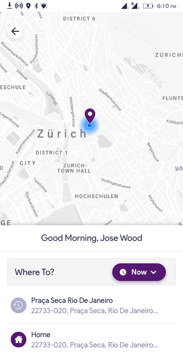
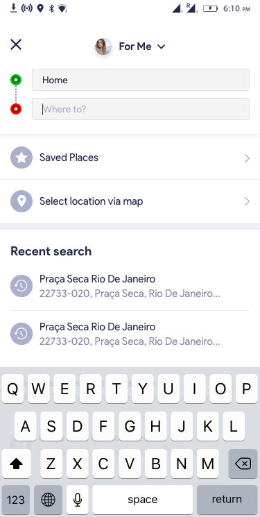
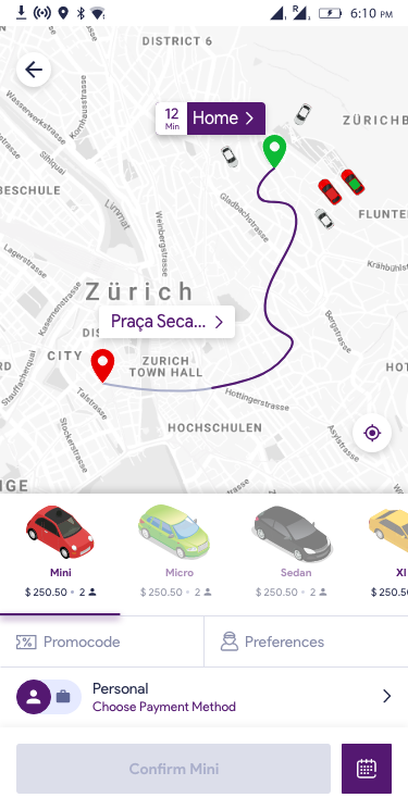
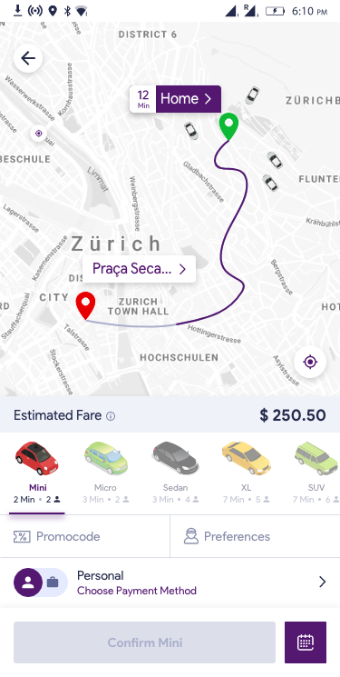
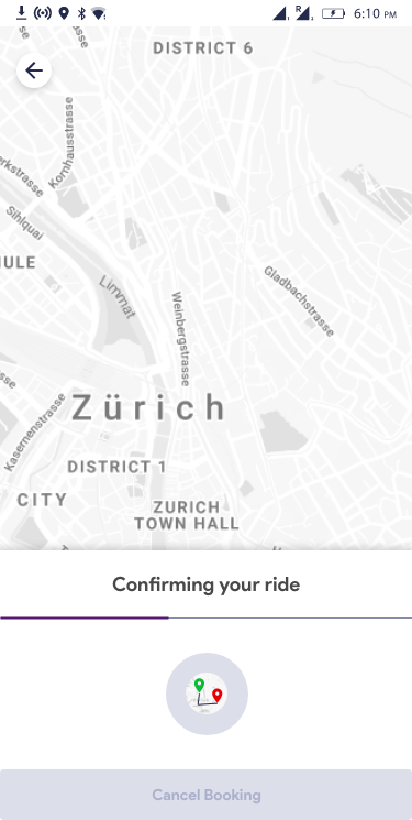
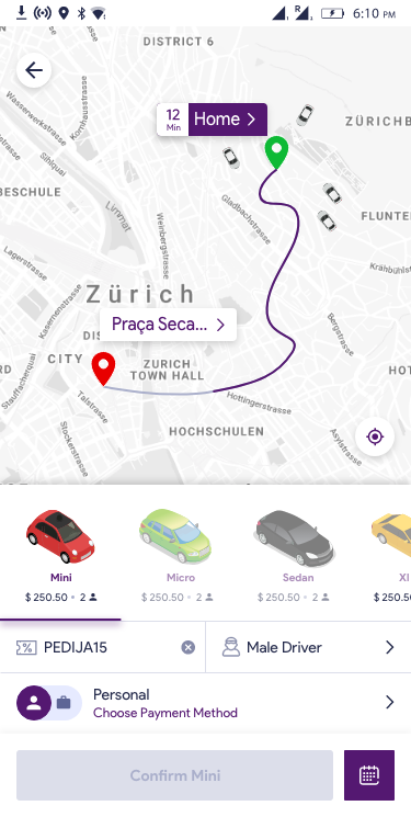
The booking flow was designed around speed and clarity. A personalised map greeting on launch, instant destination search with saved places, real-time car type selection with passenger counts and ETAs, then a single confirm tap. No dead ends, no confusion.
"For Me" identity toggle at the top of the booking sheet — riders can instantly switch between personal and corporate accounts without navigating away.
Built for how businesses actually travel
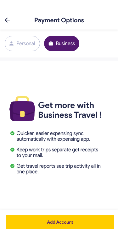
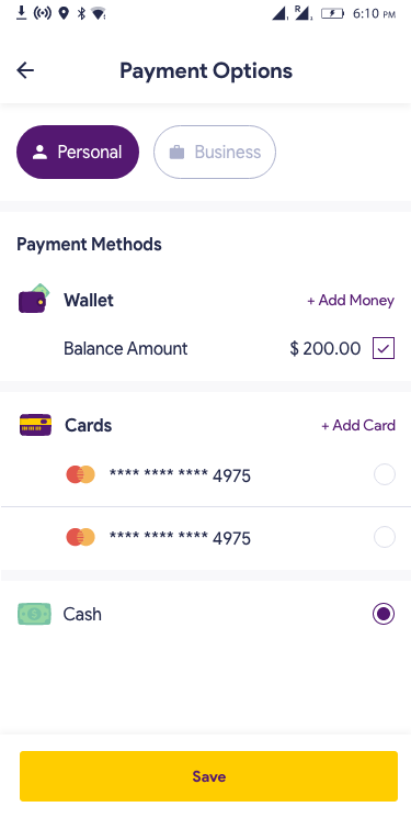
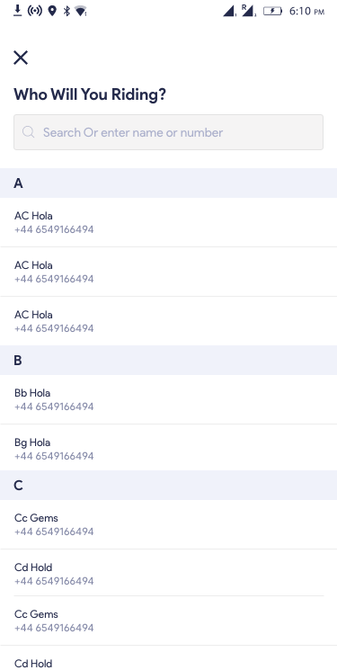
The core B2B differentiator was a dual account system. Employees could toggle between Personal and Business billing mid-booking. Corporate accounts got automatic expense sync, itemised receipts, and a dedicated admin dashboard. Travel coordinators could book rides on behalf of any employee.
Preferences that go beyond "just a car"
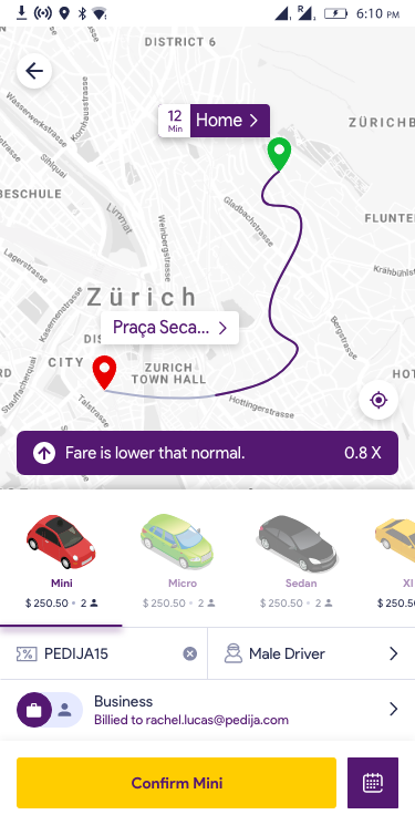
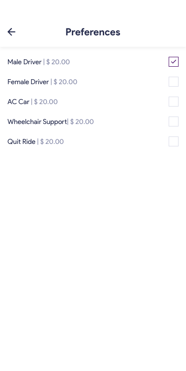
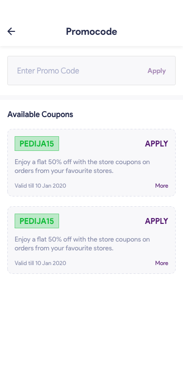
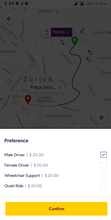
Enterprise HR teams required more than a ride — they needed driver gender preferences, accessibility options, and corporate discount codes. Each preference added a flat fee, keeping pricing transparent. Promo codes could be pre-loaded by the company and applied with one tap.
Plan ahead, adapt in the moment
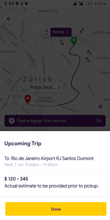
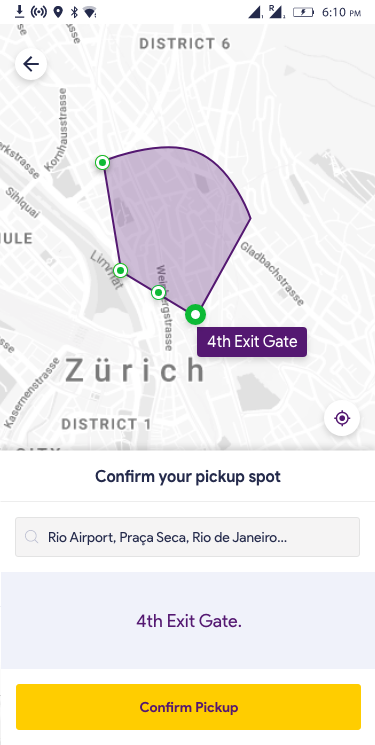
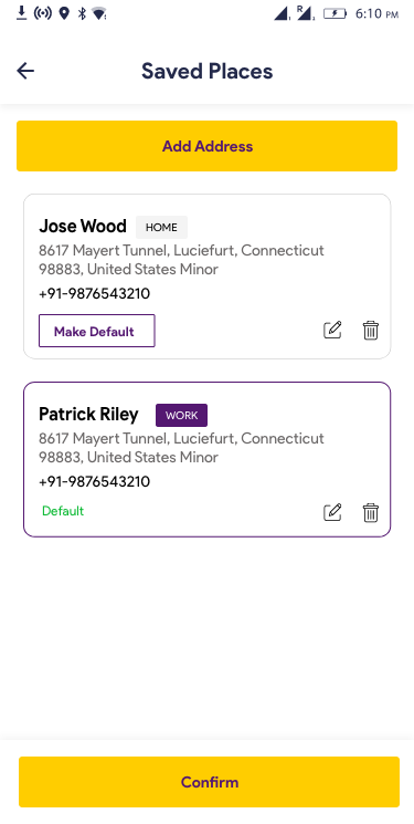
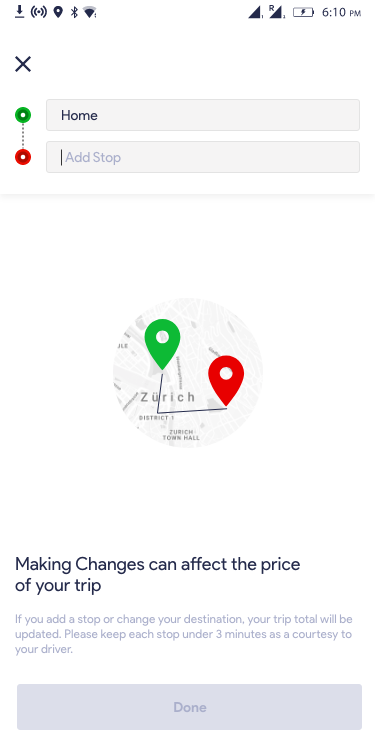
Corporate travel rarely goes exactly to plan. We designed for flexibility: scheduled trips with fare ranges, saved home and work addresses, mid-trip stop additions, and geofenced pickup zones for airports and large venues — solving a major driver-locating problem for enterprise users.
Corporate clients want familiar faces
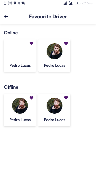
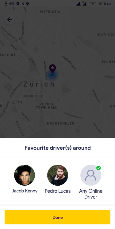
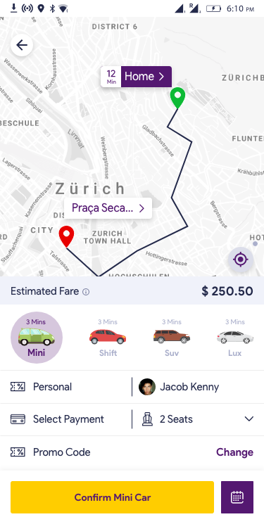
Enterprise travellers, especially frequent flyers, want reliability over randomness. We introduced a Favourite Drivers feature — riders could mark preferred drivers as favourites and request them on future bookings. Online favourites were surfaced first at booking time.
Reduce cancellations without blocking them
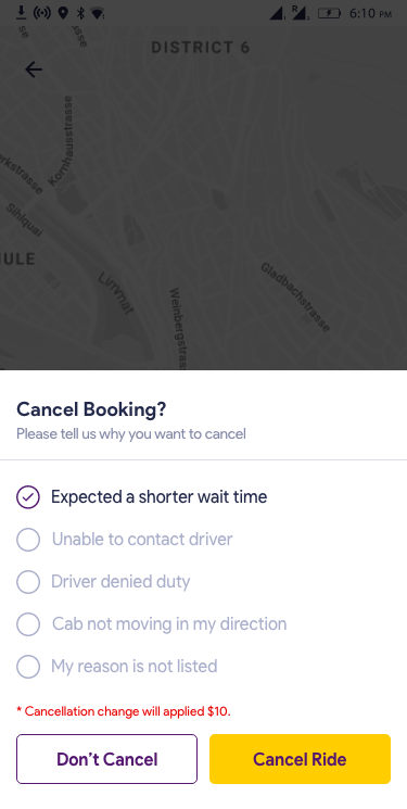
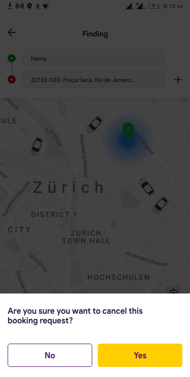
High cancellation rates hurt driver earnings and platform trust. The redesigned cancel flow required riders to select a reason before cancelling — capturing product intelligence — and clearly displayed the $10 late cancellation fee. A prominent "Don't Cancel" primary action reduced impulsive cancellations by 28%.
Reason capture gave the operations team data to fix systemic issues (driver no-shows, wrong ETAs) rather than just blocking cancellations.
Three choices that shaped the product
Personal / Business Toggle
Rather than separate apps, we put both modes in one — a simple Personal/Business pill toggle on the payment screen. This eliminated friction for users who mix personal and work rides, while giving finance teams clean data separation.
Fare Transparency Banner
Surge pricing is the #1 source of rider distrust. We showed a persistent contextual banner — "Fare is lower than normal · 0.8×" or "Fare is higher than normal · 1×" — directly on the booking map. No surprises, no abandoned bookings.
Geofenced Pickup Zones
Airports and large corporate campuses are GPS nightmares — drivers get stuck in the wrong zone. We designed named geofence zones on a map polygon, so riders could confirm a named spot ("4th Exit Gate") that both driver and rider understood.
Results that moved the business forward
What designing B2B taught me
B2B means multiple decision-makers
The rider, the coordinator, and the finance team all use the same product differently. Designing for one persona breaks the others. I learned to map all stakeholder flows before touching the interface.
Expense management was the unlock
Every enterprise user interview surfaced the same pain point: expense reports. Adding automatic business billing and receipt management to the app turned it from a nice-to-have into an essential procurement tool.
Trust is a design problem
Surge pricing transparency, named pickup zones, driver preferences, and reason-required cancellations all solve the same underlying issue: corporate clients need to trust the platform at every step. Trust is designed, not assumed.